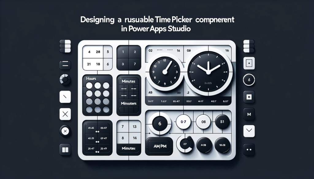
Designing a Reusable Time Picker Component in Power Apps Studio!
Overview:
This blog provides a step-by-step guide to creating a reusable Time Picker component in Power Apps Studio. By following the detailed instructions, readers will be able to design an efficient and customizable Time Selector control for their canvas app projects, enhancing the user experience and providing easy time selection.
Building an Efficient Time Picker in Power Apps Studio
Getting started is easy.
Launch Power Apps Studio and open your canvas app project.
Once you’re in, navigate to the “Screens” section on the left side and click on “Components” to move to the Components screen.
Here, start by clicking the “New Component” button.
Give your component a relevant name, preferably “cmp_ TimeSelector “.

The “cmp_TimeSelector” component should possess the following properties:
					Fill: RGBA(0, 0, 0, 0)
Height: 450
Width: 290
Designing the Hours Segment
The next step is to design the “Hours” segment. To do this, incorporate a new gallery within the component and label it “gal_ TimeSelector _Hours.” Remember, dimensions matter. Make sure the gallery dimensions align with the component’s size. Also, the numbers should have a consistent format, ideally with a leading zero.
Following that, incorporate a new gallery within the component and name it “gal_ TimeSelector _Hours.”
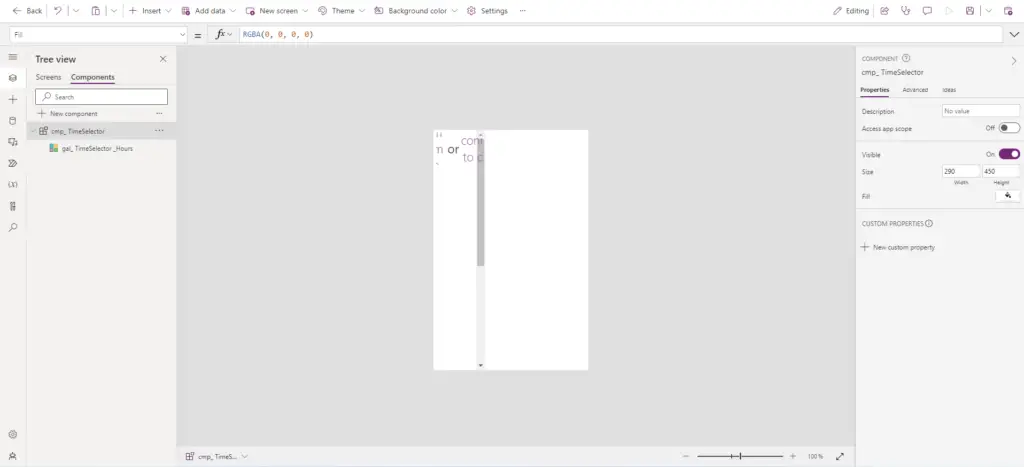
The gallery dimensions should match the component’s height, and its width should be set to one-third of the component’s width to accommodate hours, minutes, and AM/PM. Apply the following properties to the gallery
					Fill: Color.Transparent
Height: Parent.Height-10
TemplateSize: 50
Width: Parent.TemplateWidth/3
To populate the gallery with hours, you can utilize the Sequence function within the Items property. Additionally, ensure that the numbers are formatted with a leading zero for consistency.
					ForAll(
    // Loop through a sequence of 12 numbers (representing hours)
    Sequence(12),
    // Convert each number to text format with leading zeros
    Text(Value, "[$-en-US]00")
)
Now, position a label named “lbl_TimeSelector_Hours“ inside the gallery and set its Text property to “ThisItem.Value” to display the hour options.
ThisItem.Value

To style the Hours gallery before proceeding to the Minutes and AM/PM galleries, it’s advisable to apply the following properties to “lbl_TimeSelector_Hours“:
					/* Styling Properties for lbl_TimeSelector_Hours */
/* Center-align the text */
Align: Align.Center
/* Set text color to Black */
Color: Color.Black
/* Set label height to match the parent template's height */
Height: Parent.TemplateHeight
/* Display the value of ThisItem (hour) as text */
Text: ThisItem.Value
/* Set label width to match the parent template's width */
Width: Parent.TemplateWidth
/* Position the label at the top-left corner (X: 0, Y: 0) of the gallery item */
X: 0
Y: 5
Customizing the Appearance
To enhance flexibility and enable customization, it’s advisable to introduce two new input properties within the component. Create these properties named ” ColorSelected” and ” FillSelected” to control the label’s text color and background fill color respectively. This will allow for easy customization and reuse of the component across various apps.
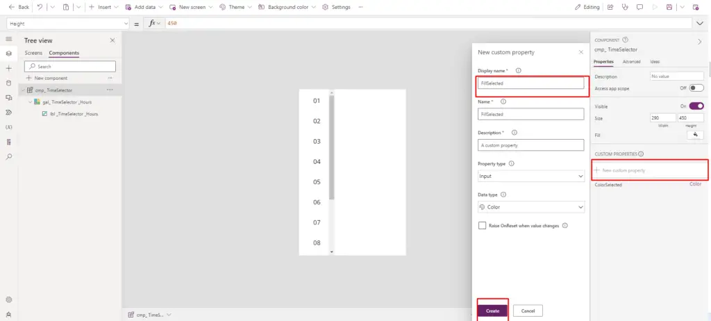
Next, include the following code within the properties for “cmp_ TimeSelector “
					FillSelected: ColorValue("#B0DAFF")
ColorSelected: Color.White
With all the necessary configurations in place, our objective is to ensure that the TimeSelector component functions as follows:

Certainly, here’s the code you can add to each respective property of “lbl_TimeSelector_Hours“ to achieve the desired result:
					Color: If(ThisItem.IsSelected,'cmp_ TimeSelector'.ColorSelected,Color.Black)
Fill: If(ThisItem.IsSelected,'cmp_ TimeSelector'.FillSelected,Color.White)
HoverFill: If(!ThisItem.IsSelected, ColorFade('cmp_ TimeSelector'.FillSelected, 70%))
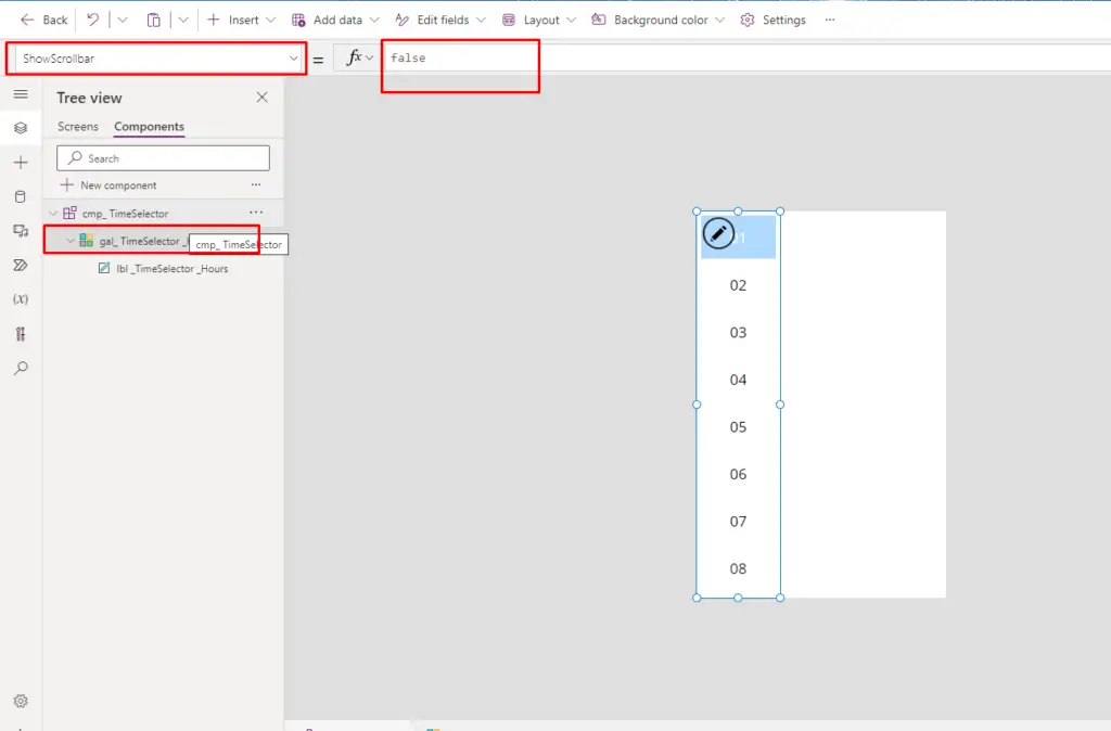
To hide the scrollbar in the gallery, set the “ShowScrollbar“ property of the Hours gallery to “false.” With this adjustment, the Hours gallery is now finished.
Crafting Minutes and AM/PM Segments
After the hours, it’s time to tackle the minutes. Duplicate the hours gallery and rename it for minutes. Adjust the code in the Items property accordingly. The AM/PM gallery requires a similar approach.
For the minutes gallery, start by duplicating the hours gallery. Just copy and paste it directly adjacent. Rename the duplicated gallery to “gal_TimeSelector_Minutes.”

Replace the existing code in the Items property with the following code to generate minute values from 00 to 59:
					/* Generate minutes from 00 to 59 using a ForAll loop */
ForAll(
    /* Create a sequence of numbers from 1 to 60 */
    Sequence(60),
    /* Convert the number (minus 1) to text format with leading zeros */
    Text(Value - 1, "[$-en-US]00")
)
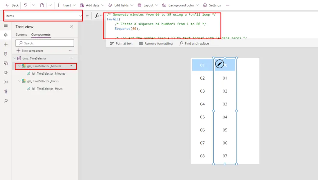
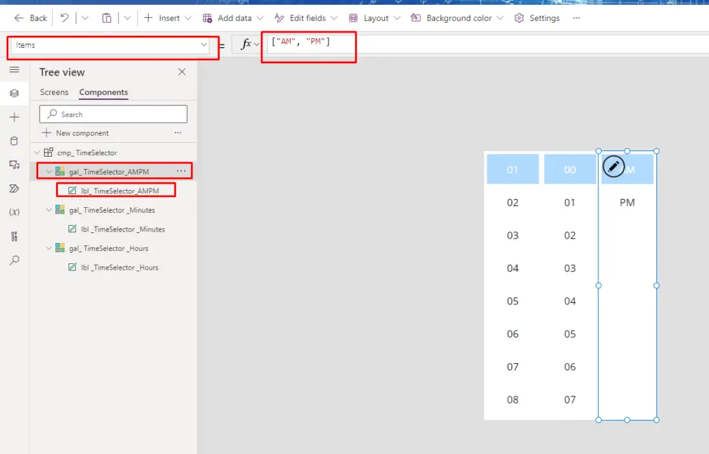
Then, for the AM/PM gallery, make another copy of the existing gallery and place it appropriately. Subsequently, rename the duplicated gallery to “gal_ TimeSelector_AMPM.”
Replace the current code in the Items property of the gallery with the following code:
["AM", "PM"]
With all the galleries created, the last control to add is a label called ” lbl_border ” which will function as a border. Ensure that this label is placed at the bottom of the control structure in the tree view.
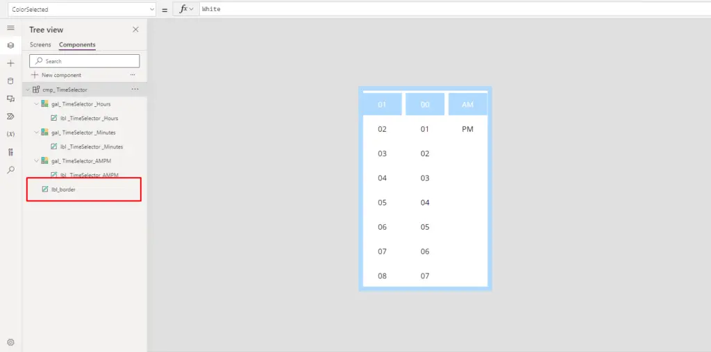
You can use the provided code in the following properties of the label
					BorderColor: 'cmp_TimeSelector'.FillSelected
BorderThickness: 10
Height: Parent.Height
Width: Parent.Width
X: 0
Y: 0
Configuring Output Selection in Power Apps Time Picker
Output Configuration Steps
- To configure the component to output a time value when a user makes a selection, follow these steps:
- To apply this code inside the Gallery’s Label OnSelect property to assign a variable for storing the selected time, you can do the following:
- Click on the gallery containing the label to select it.
- Access the Label’s OnSelect property.
- Input the following code to assign a variable within the Label’s OnSelect property:
					Set(
    SelectedTimeValueVar,
    Time(
        Value('gal_ TimeSelector _Hours'.Selected.Value)
        - If(
            Value('gal_ TimeSelector _Hours'.Selected.Value)=12, 12)
        + If(
            'gal_ TimeSelector_AMPM'.Selected.Value = "PM",
            12,
            0
        ),
        Value('gal_ TimeSelector _Minutes'.Selected.Value),
        0
    )
)

Reference: Set function in Power Apps
Certainly, you can follow the same steps for all other galleries within your PowerApps app to set the SelectedTimeValueVar variable based on the selections made in each gallery’s Label OnSelect property. To enable the reference of your time value within the app, add a new property named ” SelectedTimeValue” to the component. This property will allow users to access the selected time value easily.
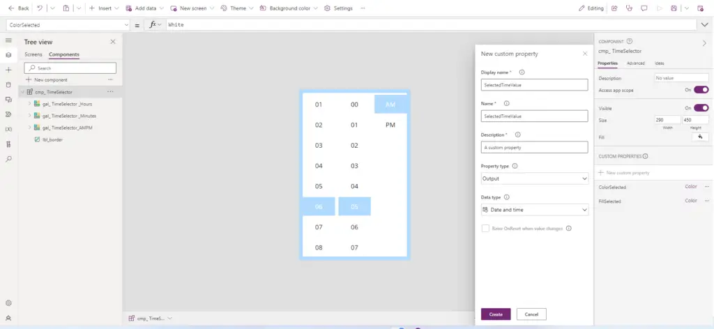
Then put this code in the SelectedTimeValue property of cmp_ TimeSelector.
SelectedTimeValueVar

To ensure that when users click on hours, minutes, or AM/PM inside the gallery, the selected item snaps to the top of the component, you can create a new property named “Default Time” Make sure to enable the “Raise OnReset when value changes” option for this property. This will allow you to achieve the desired behavior.

Set the Default value of cmp_ TimeSelector to “01:00 AM” unless otherwise defined by using the Time(1, 0, 0) function in the property. This will initialize the component’s default value as 1:00 AM.

Setting Default Values for Galleries
To define the selection positioning for each gallery using complex code, place the following code in the Default property of the Hours gallery:
					If(
    // Check if the DefaultTime is blank and SelectedTimeValueVar is also blank
    'cmp_ TimeSelector'.DefaultTime = Blank()
    And SelectedTimeValueVar = Blank(),
    // Set a default value when no default is supplied
    {Value: "01"},
    // Calculate the value when a default is supplied or hours were clicked
    With(
        {
            // Calculate the time value to be used
            WithTime: Coalesce(SelectedTimeValueVar,
                'cmp_ TimeSelector'.DefaultTime
            )
        },
        // Look up the corresponding value based on the time
        LookUp(
            Self.AllItems.Value,
            Value = Text(
                If(Mod(Hour(WithTime), 12) = 0, 12, Mod(Hour(WithTime), 12)),
                "[$-en-US]00"
            )
        )
    )
)
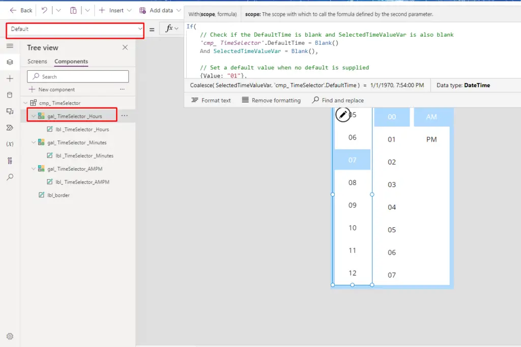
To write the given code in the Default property of the Minutes gallery, you can use the following code:
					With(
    {
        // Calculate the time value to be used, taking the selected time or default time
        WithTime: Coalesce(
            SelectedTimeValueVar,
            'cmp_ TimeSelector'.DefaultTime
        )
    },
    // Look up the corresponding value based on the minutes part of the time
    LookUp(
        Self.AllItems.Value,
        // Convert the minutes from WithTime to text format with leading zeros
        Value = Text(
            Minute(WithTime),
            "[$-en-US]00"
        )
    )
)

To use the provided code in the Default property of the AMPM gallery, you can write it like this:
					With(
    {
        // Calculate the time value to be used, taking the selected time or default time
        WithTime: Coalesce(
            SelectedTimeValueVar,
            'cmp_ TimeSelector'.DefaultTime
        )
    },
    // Determine whether the hour of WithTime is less than 12
    If(
        Hour(WithTime) < 12,
        // Set the value to "AM" when the hour is less than 12
        {Value: "AM"},
        // Set the value to "PM" when the hour is 12 or greater
        {Value: "PM"}
    )
)

Resetting the Gallery for Fresh Selections
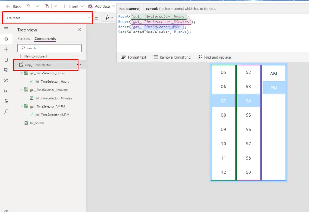
To reset the gallery when a user clicks it and display the clicked values at the top, you can use the following code in the OnReset property of cmp_ TimeSelector:
					Reset('gal_ TimeSelector _Hours');
Reset('gal_ TimeSelector _Minutes');
Reset('gal_ TimeSelector_AMPM');
Set(SelectedTimeValueVar, Blank())
Integrating the Time Picker in Your App
Utilizing the Time Picker
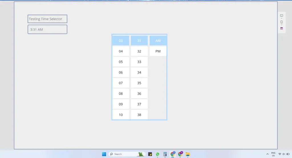
Finally, it’s time to integrate the Time Picker. Add a text input control to display the selected time. Position the Time Selector component next to it. To provide a seamless experience, consider using an overlay label.
Add a new Text input control to your app’s screen. You can do this by going to the “Insert” tab and selecting “Text input” from the control options. Position it where you want it to appear on the screen.

Place the Time Selector component next to the text box on the screen.

To display the selected time within the text input, paste the following code into the text input’s Default property.
Text('cmp_ TimeSelector_1'.SelectedTimeValue,DateTimeFormat.ShortTime)

Add a new label to the screen, positioned as an overlay. When the user clicks this label, the component should become hidden. Ensure that the label is positioned above the text input and below the Time Selector in the tree view hierarchy. ibus leo.

Insert the provided code into the following properties for the overlay:
					OnSelect: Set(Show_TimeSleector_Var, false)
Visible: Show_TimeSleector_Var
Next, update the Time Selector Visible property with the following code.
Visible: Show_TimeSleector_Var
Utilize the following code in the OnSelect property of the Text Input control.
Set(Show_TimeSleector_Var, true)

Your dedication has yielded an impressive and reusable time Selector with a polished appearance.
Conclusion:
Creating a reusable Time Picker in Power Apps Studio is a step-by-step process that requires attention to detail. By following this guide, you’ll have a functional and aesthetically pleasing component ready for integration into your Apps.

