Introduction
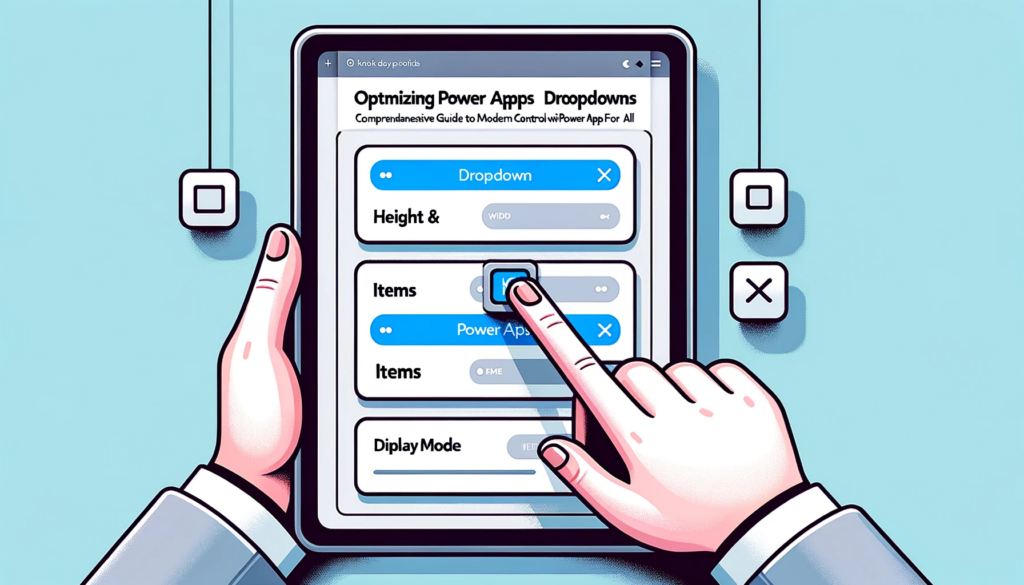
Utilizing dropdown controls in Power Apps provides an intuitive user experience by simplifying data input and selections. This powerful component enables users to choose from a set of options in an organized manner, maximizing space efficiency. In this guide, we delve deep into setting up and customizing the Power Apps dropdown with the focus on powerapps forall technique.
Understanding the Power Apps Dropdown
A dropdown in Power Apps offers the users a clickable arrow, revealing a list from which they can select a single choice. This is especially crucial when you wish to present users with a concise set of predefined options without overwhelming them.
Key Properties:
- AccessibleLabel: Voiced by screen readers upon user interaction, enhancing accessibility.
- DefaultSelectedItems: Determines the initially displayed values prior to user interaction.
- ContentLanguage: Sets the audience’s language preference (for example, “en-US”).
- DisplayMode: Configures the control’s state –
- DisplayMode.Disabled – The control appears greyed-out.
- DisplayMode.Edit – Enables user input.
- DisplayMode.View – Allows viewing values without editing.
- Height & Width: Define the dimensions of the control.
- Items: Represents the values within the dropdown. For instance: [“Option A”, “Option B”, “Option C”].
- OnChange & OnSelect: Dictates actions based on value changes or user selections.
- Required: An attribute that signifies if a dropdown selection is mandatory.
- Selected & SelectedItems: Displays items picked by the user.
- Text: The textual content visible on the control.
- Visible: Decides the visibility of the control.
- X & Y: Coordinates defining the control’s screen position.
Configuring the Dropdown Control
- In the Power Apps studio, select the dropdown control and specify the data source in the ‘Items’ menu.
- Define your fields. It’s crucial to incorporate at least one field to the dropdown. The primary field becomes visible within the dropdown’s list of items.
- Activate the dropdown control to view the populated items.
- Retrieve the chosen item’s Title field with the code:
DropdownPanel1.Selected.Title.
Incorporating dropdown controls, especially when combined with techniques like powerapps forall, can significantly enhance user experience in Power Apps. Ensuring the control is set up correctly and tailored to your needs is vital.
For any challenges or further insights into optimizing your Power Apps experience, do not hesitate to reach out to us. We specialize in providing tailor-made solutions to elevate your Power Apps journey.


