PowerApps Forms Guide: Harnessing the Power of Horizontal Galleries and Data Integration
Welcome to our PowerApps Horizontal Galleries Guide, a comprehensive tutorial on PowerApps Forms. In the era of dynamic data management, PowerApps has emerged as an essential tool for developers, especially when harnessing the capabilities of horizontal galleries.Contact us
Launching Your PowerApps Form Journey
Begin with an unoccupied tablet form. Navigate to ‘Insert’ within the main ribbon, followed by choosing the ‘Gallery’ option. This action triggers PowerApps to initiate a vertical gallery. Transition to the ‘Data’ segment to pinpoint your preferred data source. This should be readily visible in a right-hand panel, which PowerApps utilizes to fill your gallery.
Formulating and Observing a New Form
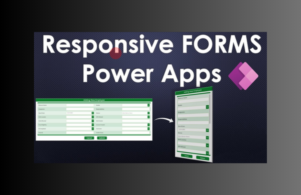
For form creation, click on the ‘Form’ segment. Two distinct types should surface – ‘edit’ and ‘display’. The former provides a platform to both observe and modify data, whereas the latter restricts to viewing alone. As a rule of thumb, opt for the edit form to retain adaptability. PowerApps then prompts for a data source selection. Ensure it aligns with your gallery’s source for seamless synchronization. Post-selection, PowerApps crafts your form. A brief pause later, a fresh form should emerge within your gallery, which you can then manipulate as required.
Feeding and Populating Your Information
Fields corresponding to each gallery card will be showcased by PowerApps. However, they might remain vacant initially. Tap on the ‘Data Source’ box and switch to ‘Item’. Adjusting this property determines data items. Subsequently, input ‘Gallery1.Selected’ to instruct PowerApps on the data population basis your selection.
Editing and Handling Data Cards
Upon form selection, editing variants should appear on the right. Tapping on ‘Data,’ ‘Fields,’ or ‘Layout’ uncovers additional options. The ‘Snap to columns’ feature is pivotal for impeccable form design, facilitating dynamic window adjustments and consistent sizing. Additional columns enhance precision and desired layouts.
Custom Data Card Generation
Within the ‘Fields’ subsection, utilize the ellipses to incorporate a tailored data card. Navigate to the list’s end to spot ‘DataCard1’. This can be positioned beneath the ‘Title’ card. Activate the preview mode. The resultant whitespace enhances the form’s professional aura. Embedding images or text is facilitated by selecting the data card and tapping the ‘Icons’ section.
Card Fields and Design Management
Select ‘Form 1’ from the left list. The ‘Layout’ option lets you present fields either vertically or horizontally. Every input field gets a unique card, with configurations accessible upon selection. PowerApps autonomously selects each card’s data type. Any discrepancies need resolution at the data source end.
Unlocking Cards for Advanced Edits
By default, data cards are locked. To unlock, use the ‘Advanced’ section within card properties. Custom cards can be reset to default configurations if issues arise.
In conclusion, our PowerApps Horizontal Galleries Guide offers insights into crafting data-driven solutions using PowerApps. Should you need further assistance, please contact us.

