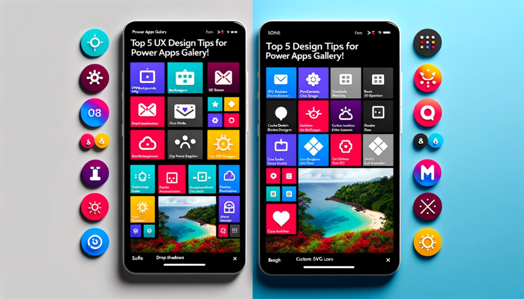
Top 5 UX Design Tips for Power Apps Gallery!
Overview:
In this post, we dive deep into the world of Power Apps UX design.
Explore the top “Power Apps UX Design Tips” to enhance your gallery’s look and functionality.
These five techniques can significantly enhance the aesthetics and functionality of your Power Apps galleries.
1.Premium SVG Backdgrounds:
I prefer using SVG images for my app backgrounds for two main reasons. Firstly, they maintain their high quality regardless of screen size.
Secondly, their intricate patterns provide a more engaging visual experience compared to plain solid color backgrounds.
Wondering where to find these awesome backgrounds? Check out SVGBackgrounds.com. A little wink there! There’s a wide variety of free SVG backgrounds available.
I opted for the ‘Abstract Envelope‘ design and colored it with shades #3265AA, #44A4FF, and #46EEFF. Once you’ve settled on a background, hit the export button to secure the image file. Then choose ‘Download SVG‘.
Head over to the Power Apps studio, start a fresh app, and upload the SVG through the Media section. Assign the ‘Background Image’ property of your screen to the SVG image’s name.

Download image from SVG images and use them in PowerApps as background images
2.UX Cards Featuring Drop Shadows:
A User Experience (UX) card acts as a visual container, showcasing bite-sized, interrelated details about an item in a gallery. Instead of having UX cards that appear dull and flat, enhance them with captivating drop shadows.
Start by adding an empty vertical gallery to your screen.
					Items: Sequence(12)
Height: App.Height
Width: App.Width
X: 0
Y: 0
TemplateSize: 140
TemplateFill: Transparent
TemplatePadding: 0
ShowScrollbar: false
And apply these properties.
Next, within the gallery, insert an HTML Text control which will serve as the card.

Use this code on properties.
					X: 0
Y: 0
Width: Parent.TemplateWidth
Height: Parent.TemplateHeight
Next, assign this code to the HtmlText property. This code incorporates inline CSS to craft a UX card that has a drop shadow.
div style=""margin: 12px 10px 8px 10px; width: "&(Self.Width-31)&"px; height: "&(Self.Height-31)& "px; background-color: white; box-shadow: 0 4px 8px 0 rgba(0,0,0,0.2); border-radius:5px""></div>
Reference: HTML text control in Power Apps

3.The Art of Text Design: Using Size, Color & Font Weight:
While I may not be a graphic designer, I understand the significance of creating a typographic hierarchy when designing a card.
This involves guiding the reader’s attention using elements like size, color, font weight, and orientation.
Among all the Power Apps design recommendations, this particular one stands out to me.
It’s straightforward, yet incredibly impactful. In the following illustration, we’re instantly attracted to the title “Initial Sample Verification.”
Next, our attention shifts to the sample ID number, and then we take in the secondary details in the subsequent row

Add labels in the gallery according to your need and use the following code on the text Property of label
					"$" &  ThisItem.'Order Amount '

ThisItem.'Barcode Value'
Adjust these codes according to your needs .
4.Designing Unique SVG Icons: A Guide:
Power Apps provides a default collection of icons. While they’re decent, there’s always room for improvement.
If you’re looking for more variety, I have a collection of 2,000 Fluent UI SVG icons available on my website.
However, for this demonstration, we’ll be integrating icons from Google’s Material Design available at materialdesignicons.com.

5.Vibrant Status Indicator Dots:
To be frank, I simply added a colorful dot to each card to enhance its visual appeal. In a practical setting, this isn’t the best design choice.
Proper design would utilize color to signify an item’s status, its category, or its relation to other gallery items.
However, for those curious, here’s how I achieved it.
Add a button in the gallery and adjust these properties according To this
					Height:20
Width:20
Radius:20

I have compared the button fill color with the ID column to show how it actually works
you must compare it With the status of the task or anything else
Use this code on the fill property of the button.
Switch(ThisItem.ID,14,Color.Orange,15,Color.DarkGreen,16,Color.DarkGoldenRod,17,Color.Navy,18,Color.DarkRed)
Reference: If and Switch functions in Power Apps
Update the ‘Items‘ property of the gallery to use the new code provided.
Now, Every record in the table has an associated color.
Conclusion:
Power Apps offers vast potential for creating intuitive and visually appealing applications. By leveraging these top 5 UX design tips, developers and designers can ensure a more engaging and user-friendly experience, setting their Power Apps galleries apart from the rest.
