Creating Multi-Page Forms in PowerApps
Overview:
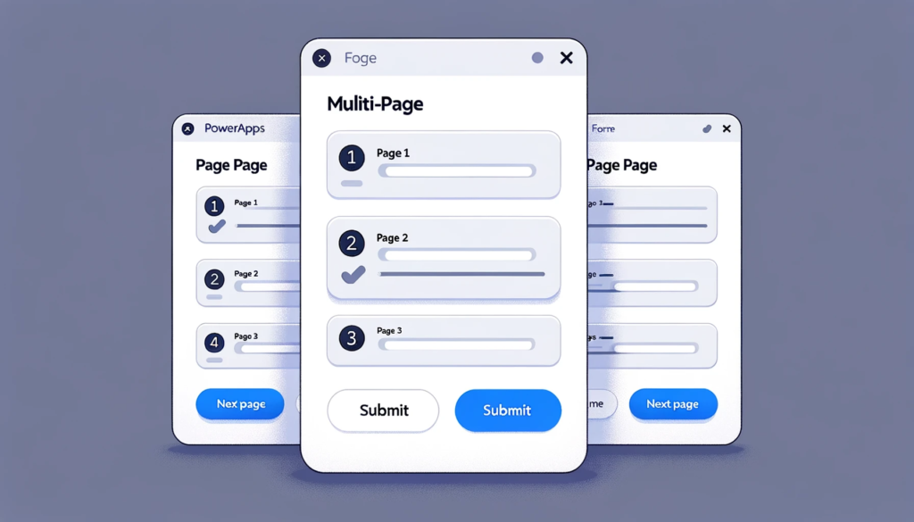
In the modern application design, ensuring a seamless user experience is crucial. In situations where a form contains an extensive amount of questions or fields, presenting them all at once can overwhelm the user. “Multi-Page Forms in PowerApps” offers a solution to this issue. In this blog post, we walked through a step-by-step guide to creating multi-page forms within PowerApps, allowing for a more organized and user-friendly interface.
The final app will have the following appearance:

Create a form with Tabs
In this example, the form comprises 12 questions, which cannot be displayed on the screen all at once. To enhance its design, we will create three separate pages, each containing four questions. Additionally, we’ll implement tab-style navigation above the form for improved usability.

Start by adjusting the form’s height so that only four questions are displayed at a time.

Next, create an empty horizontal gallery. Inside this gallery, insert a button that will generate several buttons arranged side by side. Position the gallery above the form.


Next, we will configure the button text to appear as follows:

Place the following code in the Items property of the gallery:
["Page 1","Page 2","Page 3"]

Now, insert the following code in the Text property of the button:
ThisItem.Value

For the selected page button, we desire a Black with white text, while any unselected pages should have a white fill with Black text.

To specify the selected page, insert this code in the OnSelect property of the button:
UpdateContext({CurrentPage_var:ThisItem.Value})

Now, apply this code to each relevant property of the button:
– Set the Fill property to change the button’s background color based on selection.
– Set the Color property to alter the text color accordingly
. – Modify the BorderColor property to define the border color.
– Adjust the BorderThickness property to specify the border thickness.
Here’s the code with the revised wording applied to each property of the button:
					- **BorderColor**: Color.Black
- **BorderStyle**: Solid
- **BorderThickness**: 1
- **Color**: White if the current page matches (locCurrentPage = ThisItem.Value), otherwise Color.Black
- **Fill**: Color.Black if the current page matches (locCurrentPage = ThisItem.Value), otherwise White
- **HoverColor**: Self.Color
- **HoverFill**: Self.Fill
-**PressedColor**: Self.Color
- **PressedFill**: Self.Fill
These settings define the button’s appearance and behavior for both the selected and unselected pages.
Lastly, we aim to display only the relevant data cards when a specific page is selected.

Insert this code into the Visible property of the DataCards to ensure that only the relevant ones are displayed based on the selected page.
Certainly, here is the code with comments for setting the Visible property of the DataCards:
For DataCards 1 to 4 (1-4 data cards):
					// Show these DataCards when "Page 1" is the current selected page Visible:
CurrentPage_var = "Page 1" ```
For DataCards 5 to 8 (5-8 data cards):
					// Show these DataCards when "Page 2" is the current selected page Visible:
CurrentPage_var = "Page 2" ```
For DataCards 9 to 12 (9-12 data cards):
					// Show these DataCards when "Page 3" is the current selected page

Visible: CurrentPage_var = "Page 3"
These comments explain that each group of DataCards will be visible based on the selected page.
(Page 1, Page 2, or Page 3).
You now have a tab-style navigation located above the form.

Remember to apply this code to the OnVisible property of the screen to ensure that the Form consistently opens on Page 1.
UpdateContext({CurrentPage_var:"Page 1"})

To enhance user convenience, we will incorporate Next Page and Previous Page controls.

Increase the Height property of the form by 50 units, and position a label displaying the text “Next Page >” on it, as illustrated in the image below.
Reference: UpdateContext function in Power Apps
					 Switch(CurrentPage_var,

"Page 1",UpdateContext({CurrentPage_var:"Page 2"}),

"Page 2",UpdateContext({CurrentPage_var:"Page 3"}))

We want the Next Page label not to appear when the form is on Page 3. Use this code in Visible property of the Next Page label to control when it is shown.
CurrentPage_var<>"Page 3"

Now that the “Next Page” label is functioning, let’s also create a “Previous Page” label. Insert a new label and position it as indicated in the image below.

Place this code in the OnSelect property of the “< Previous Page” label to determine the form’s next navigation step.
					Switch(CurrentPage_var,

"Page 2",UpdateContext({CurrentPage_var:"Page 1"}),

"Page 3",UpdateContext({CurrentPage_var:"Page 2"}))
Reference: UpdateContext function in Power Apps
To ensure that the “Previous Page” label does not appear on Page 1, apply this code to its Visible property.
CurrentPage_var<>"Page 1"
Finally, to display the “Submit” button only when the user is on Page 3, make use of the following code in its Visible property.

Apply this code to the Visible property of the “Submit” button to ensure it is visible exclusively on the last page of the form.
CurrentPage_var="Page 3"

Final Setup
We have now completed the creation of all form navigation controls, successfully implementing a multi-page form on a single screen.

SubmitForm(Form3)

Conclusion:
Creating Multi-Page Forms in PowerApps is a game-changer for both developers and end-users. By breaking down a long form into manageable sections and leveraging tab-style navigation, developers can ensure a smoother, more intuitive experience for the users. This approach not only enhances the design of the app but also greatly improves usability. As PowerApps continues to be a go-to platform for business solutions, utilizing techniques like multi-page forms will undeniably play a significant role in optimizing user interactions and overall app efficiency.
