Power Apps Curved Header UI Design For Mobile Apps
Overview:
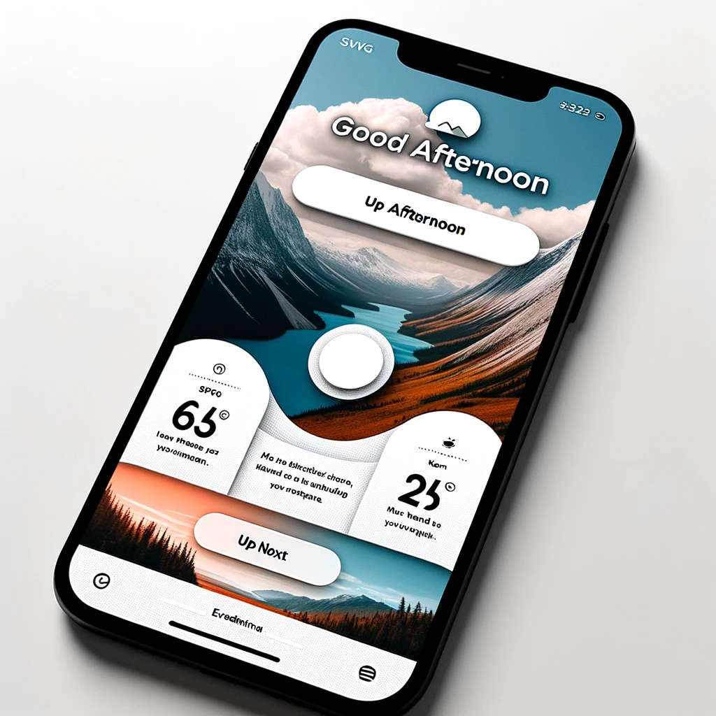
In this tutorial, readers are guided through creating a unique curved header UI design for mobile apps using Power Apps. This design uses an SVG image to achieve a rounded bottom on the home screen, adding a modern touch to app interfaces.

Incorporate a Header Image

Assign the following properties to the vertical container.
					Height: Parent.Height
LayoutOverflowY: LayoutOverflow.Scroll
X: 0
Y: 0
Width: Parent.Width
Next, insert an undirected container within the vertical container. Undirected containers serve the purpose of stacking objects vertically, one on top of the other.

Disable the flexible height attribute of the directionless container and configure its properties according to the following code.
					AlignInContainer: AlignInContainer.Stretch
Height: 385
Generate an empty image control and place it within the container without a specified orientation.

Enlarge the image control to occupy the container without any specific direction using these properties.
					Height: Parent.Height
ImagePosition.Fill
X: 0
Y: 0
Width: Parent.Width
Next, select an image to place within the image control. You can locate the mountain image used in this tutorial below. Download the image of the mountains, upload it to your application, and then assign it to the image property of the image control.

Create A Custom Shape Divider
To craft the curved image featured on the home screen, we’ll need to create an SVG divider image.
Navigate to the Shape Divider App and configure the settings as follows:

					Shape: Curve

- Color: #FFFFFF

- Flip: No

- Invert: Yes

- Placement: Bottom

- Height: 100px

- Width: 100%
Click on the download button to obtain the code and select the “Download SVG” option.

Access the SVG image file by using Notepad or an alternative text editor.

Substitute all the double-quotes within the SVG with single-quotes while keeping the file open. We’ll be needing it shortly.

Apply The Curved Divider Shape To The App
Place an additional image control within the container without a specified direction. Position it over the mountains image.

Arrange the image at the lower part of the directional container by applying these settings, and expand the image to cover the entire control.
					Height: 100
ImagePosition: ImagePosition.Stretch
Width: Parent.Width
X: 0
Y: Parent.Height-Self.Height
Subsequently, insert the SVG code acquired from Shape Divider App into the Image property of the image control.

Additional code needs to be incorporated into the existing SVG code within Notepad. Initially, it’s essential to specify the data type enclosed within the data URL. Subsequently, we encode the SVG image into a URL string using the EncodeUrl function.
(“Enclose your code within brackets.”)
"data:image/svg+xml;utf8, "&EncodeUrl("")
Furthermore, we aim to modify the SVG divider shape’s fill color, transitioning it from white to a light gray hue. Please substitute the existing fill property with the following hexadecimal code.
fill='#EDEDED'
Display Welcome Messages To The User
We have completed the customization of our app header by incorporating a welcoming message.

Insert a new label and give it these properties:
					Color: White
Font: Font.'Segoe UI'
Size: 24
To exhibit a welcoming message according to the current time, insert this code into the Text property of the first label:
If( Hour(Now())<12, "Good Morning", Hour(Now())<17, "Good Afternoon", "Good Evening" )
Reference: If and Switch functions in Power Apps
Next, introduce a second label with the following settings:
					 **Color:** White

- **Font:** Font.'Segoe UI'

- **Size:** 32
To retrieve the user’s name, utilize the User function and include this code in the Text property of the label:
User().FullName
Insert A Section Header
At this juncture, we’ve seamlessly incorporated a curved SVG divider image into the application. To finalize the home screen, let’s proceed with a few additional quick actions. Simply position a new label within the vertical container.

Enter this in the Text property of the label: Emojis can be inserted by pressing the [Windows Key] + [Period].
“Up Next “
Apply these properties to the label:
					AlignInContainer: AlignInContainer.Stretch

Color: ColorValue("#27437D")

Fill: ColorValue("#EDEDED")

FontWeight: FontWeight.Bold

Font: Font.Lato Size:
Include an additional label within the vertical container to serve as a divider.

Assign these properties to the separator label:
					AlignInContainer: AlignInContainer.Stretch

Fill: ColorValue(“#747474”)

Height: 1
