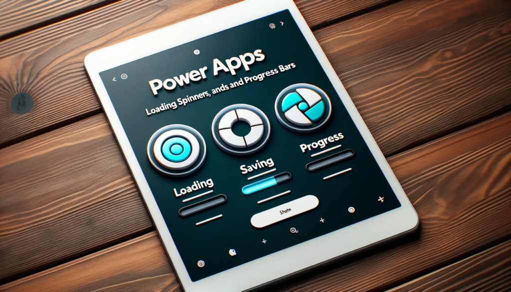
Power Apps Loading Spinners, Saving Spinners, and Progress Bars!
Overview:
Power Apps, a widely-used business solution tool, sometimes faces lags in data operations. This article guides you on how to enhance the user experience by integrating loading spinners, saving spinners, and progress bars.
Choosing and Customizing the Right Spinner for Power Apps
To elevate your Power App’s interface, first, consider the type of spinner. Obtain spinner images from online resources, such as svgbackgrounds.com. This platform offers a plethora of free spinner images and extensive customization options.

Implementing Load Spinners in Power Apps:
After downloading, integration becomes the next step. When a user selects an item from a gallery, a loading spinner significantly enhances the experience by providing visual feedback during the wait. Here’s how:

Code Implementation
By adding specific code to the OnSelect property of the gallery, the spinner is set to appear while data loads and vanishes thereafter.
					// Set the showSpinner_var to true to display the spinner

UpdateContext({showSpinner_var: true});


// Navigate to the 'DataEntryScreen' with the selected record from 'Expense Totals'

Navigate(DataEntryScreen, ScreenTransition.None, {CurrentRecord_var: LookUp('Expense Totals', ID = Gallery2_4.Selected.ID)});


// Set the showSpinner_var to false to hide the spinner once the navigation is complete

UpdateContext({showSpinner_var: false});

Uploading and Positioning
It’s essential to upload the spinner image you obtained from Loading.io to the Power Apps media section. Ideally, placing the spinner at the screen’s center guarantees visibility.


Overlay Functionality
Also, introducing a label with a Fill property of RGBA(0,0,0,0.1) acts as an overlay, inhibiting other user actions.

Utilize the showSpinner_var variable in the Visible property of both the loading spinner and the label. This variable will control their visibility based on the loading status.
Now, when the user clicks on a gallery item, the loading spinner will be displayed until the form appears. It’s as
simple as that!

The Art and Magic of Saving Spinners:
Saving spinners play a pivotal role during data saving processes. By tweaking the OnSelect property of the Submit button and the OnSuccess property of the form, the spinner’s appearance adjusts based on the data-saving status.
Effective Positioning
Centering the spinner image on the form, coupled with a white label overlay, magnifies user engagement. Additionally, a label with RGBA(0,0,0,0.1) augments the display.

- Insert this code in the OnSelect property of the Submit button to activate the saving spinner.
					UpdateContext({showspinner2_var:true});

SubmitForm(Form1_1)
Reference: UpdateContext function in Power Apps

- Now, write this code in the OnSuccess property of the form. This will ensure that the saving spinner disappears once the form data has been successfully saved.
UpdateContext({showspinner2_var:false})

- Duplicate the spinner image and place it at the center of the form.

Next, generate a label with a white Fill property and position it directly over the form.

Once more, add a label with the Fill property set to RGBA(0,0,0,0.1) to cover the entire screen. This label will serve as an overlay.

Include the showspinner2_var variable within the Visible property of all three controls. This variable will determine their visibility based on the spinner status.
showspinner2_var
- Now, a spinner will be displayed until the form has completed writing data back to the data source.

Progress Bars: Beyond Spinners
For extended data operations, the indispensability of a progress bar becomes evident. It provides real-time feedback, ensuring users that the app remains active.
Setting Up for Progress Bars
Starting with the “Admin Screen”, a toggle named “Admin_tog” is pivotal. As you proceed to the “Loading Data” screen, codes in various properties automate processes, update metrics, and ensure user-friendly interfaces.
Crafting the Perfect Progress Bar
This involves introducing labels, adjusting colors, and employing codes for dynamic updates. Ultimately, you have a responsive progress bar that modifies itself as data is processed.

Create another new screen and name it “Loading Data.” On this screen, insert a button labeled “Load_Data_button“

Upon reaching the Loading Screen, the button will automatically activate. Place this code in the OnVisible property of the Loading Screen.
If(Admin_tog,Select(Load_Data_button))
Reference: If and Switch functions in Power Apps
Next, apply this code to the OnSelect property of the button. This pattern involves updating two variables before loading each table: locLoadingMessage, which displays a message on the screen, and locLoadingPercent, which incrementally widens the progress bar. Predicting the precise completion percentage is often challenging, so it’s typically necessary to make an estimate and set these values manually.
// Update loading message and set progress to 20% while loading Table 1 (Employees)
UpdateContext({
   Loading_msg: "Loading Table 1...",
   Loading_percent: 0.2
});
ClearCollect(Col_table1, Employees);
// Update loading message and set progress to 40% while loading Table 2 (Paid Time-Off)
UpdateContext({
    Loading_msg: "Loading Table 2...",
    Loading_percent: 0.4
});
ClearCollect(Col_table2, 'Paid Time-Off');
// Update loading message and set progress to 65% while loading Table 3 (Running Totals)
UpdateContext({
    Loading_msg: "Loading Table 3...",
    Loading_percent: 0.65
});
ClearCollect(Col_table3, 'Running Totals');
// Update loading message and set progress to 90% while loading Table 4 (ProductList)
UpdateContext({
    Loading_msg: "Loading Table 4...",
    Loading_percent: 0.90
});
ClearCollect(Col_table4, ProductList);
// Update loading message to indicate loading is complete and set progress to 100%
UpdateContext({
    Loading_msg: "Loading Complete",
    Loading_percent: 1.0
});
// Navigate to the 'DataEntryScreen' with a cover screen transition
Navigate(DataEntryScreen, ScreenTransition.Cover)
To conceal the button when our app is not in Admin Mode, utilize this code in the Visible property of the button.
Admin_tog
Now, let’s craft the progress bar. Add a slim rectangle-shaped label to the screen, modify the fill color to dark gray, and position it at the center of the screen.

Duplicate the dark gray label, naming it “rect_Progress_Bar” and adjust its Fill property to blue.

To expand the size of the progress bar as data loads into the collection, utilize this code in the Width property of the “rect_Progress_Bar“
rect_Progress_Bar.Width*Loading_percent

Create another label and position it above the progress bar to display the current status.

Place the locLoadingMessage label within the Text property of the label positioned above the progress bar.
Loading_msg

The progress bar now expands as data is loaded, keeping the user informed about the app’s ongoing processes.

Usage Insights and Best Practices:
Power Apps remains an anchor for countless organizations, hence optimization is paramount. Current design trends lean towards minimalist spinners. Thus, clarity becomes indispensable. Regular feedback further hones user satisfaction.
Conclusion:
In essence, loading spinners and progress bars transcend mere aesthetics. They offer instantaneous feedback, ensuring users remain engaged, even during potential waits. Adhering to the steps delineated above empowers developers to fashion a frictionless interface that curtails operational snags.
