Harnessing Badge Control in Modern Apps
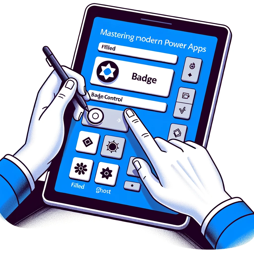
In today’s dynamic digital environment, it’s essential to swiftly offer relevant information. The badge control in Power Apps fulfills this need effectively. It enables developers to present vital details concisely, such as displaying a user’s initials or a status symbol. With this control, users can quickly grasp needed info without skimming through long text. In this guide, we delve into the varied features of this essential tool.
Delving into the Badge Control Properties
This unique control provides a neat method to showcase snippets of data to the user. Below are its primary features:
Appearance Property
This attribute tailors the badge’s look. Options include:
- Filled
- Ghost
- Outlined
- Tint
Content Property
Describes the badge’s internal text.
ContentLanguage Property
Specifies the language, such as “en-US”.
DisplayMode Property
This feature allows mode selection:
- Edit: Allows user entries.
- View: Displays values only.
- Disabled: Appears inactive.
Dimensional Properties
These define the badge’s placement and dimension:
- Height: Top to bottom distance.
- Width: Left to right span.
- X: Distance from the left screen boundary to the control.
- Y: Vertical gap from the screen’s top.
Additional Properties
- OnChange: Functionality not defined yet.
- Visible: Dictates the control’s visibility.
Implementing the Control
To activate:
- Choose the badge tool in the Power Apps workspace.
- For instance, input “MD” in the Content segment.
Reference: Badge control in Power Apps (preview)
Conclusion
The badge control in Power Apps streamlines the presentation of concise yet crucial data to users. Its multifaceted features grant developers extensive adaptability in presentation and operation. To maximize such modern tools, profound knowledge and practice are key. contact us. Our team of professionals is always ready to assist and ensure you capitalize on the latest digital tools and trends.

