Extend Canvas Apps with Additional Chart Types: A Comprehensive Guide
Ever felt the need to elevate the charting capabilities of your canvas apps? While the built-in chart types serve most purposes, there are scenarios when you crave for more versatility. This guide aims to introduce an effective solution for incorporating an expansive array of chart types to enhance your canvas apps’ functionality. Whether you’re an app developer or a business looking to visualize data in more meaningful ways, this read is for you.
Limitations of Built-In Canvas App Chart Types
By default, canvas apps provide users with the primary chart types, including bar, line, and pie charts. However, there’s an entire world of chart types out there waiting to be explored.
Unleashing the Power of Canviz Power Apps Chart Components
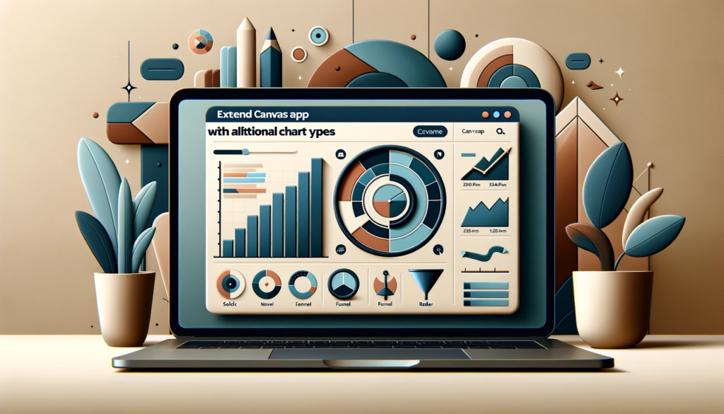
Canviz Power Apps Chart Components, conceptualized by Todd Baginski, stands out as an innovative solution to this limitation. With its introduction, users can harness the power of additional chart types such as radar, funnel, scatter, candlestick, and even gantt charts.
Key Features of Canviz Power Apps Chart Components
- A diverse range of nine chart types, encompassing solid gauge, funnel, line, bar, pie, radar, scatter, candlestick, and gantt charts.
- Open-source availability, ensuring adaptability and community support.
Integrating Enhanced Chart Types into Canvas Apps
One of the most exhilarating features of these charts is that they come as a canvas component within an msapp file. Here’s how you can integrate them:
- Download and import the component into your app.
- Add the chart component to your desired screen.
- Configure the chart by setting the ‘chart type’ and adjusting the data properties accordingly.
Note
If you’re new to these controls or need a detailed guide on their application, don’t hesitate to contact us. Our experts are always ready to assist you with any technical queries or guidance.
Conclusion
The Canviz Power Apps Chart Components truly revolutionize the charting potential of canvas apps. However, it’s essential to note that data delegation limitations in canvas apps can sometimes impede accurate data representation, especially when aggregating records. For larger datasets, considering alternatives like Power BI might be more apt. Nonetheless, for a majority of the use cases, this component can be a game-changer. If you ever find yourself stuck or need further assistance, remember, we’re just a click away. Reach out to SoftwareZone365 today!